


A website is your brand’s digital emissary. It’s the most important point of interaction between you and your potential customers. Whether people want to buy from you, learn about you, or interact with you, they’ll come to your website.
Therefore, having a superior quality website is a must for every business. Even if you don’t sell online, a good-looking website can boost your branding and marketing efforts.

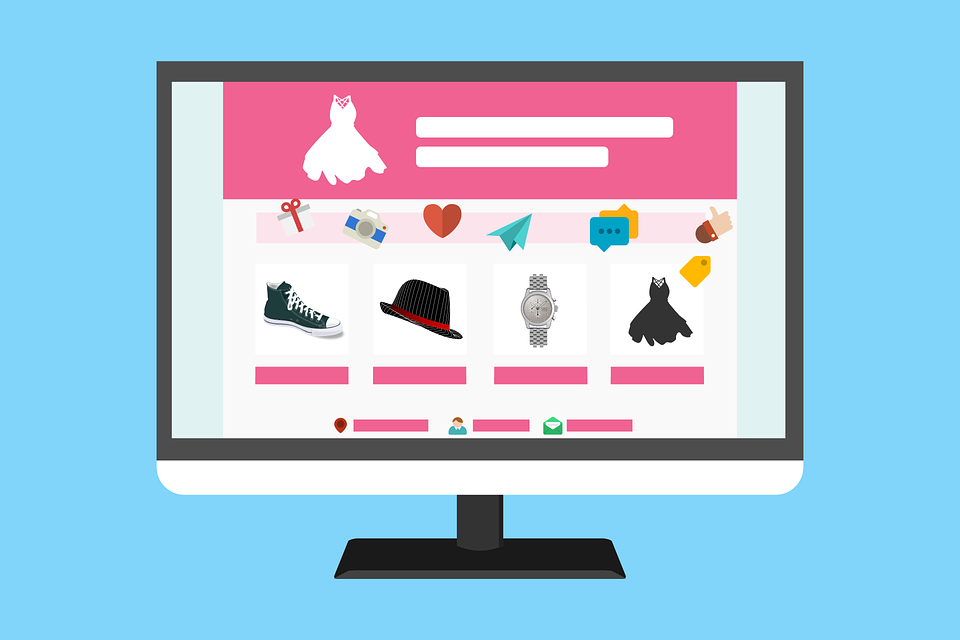
Source: Pixabay
But as customer expectations, along with website development technologies, continue to evolve, new website trends are emerging.
Let’s delve into the major website trends you should look forward to in 2021.
1. Full-page headers
Full-page headers have gained popularity in recent years, and they’re here to stay. For years, businesses have been struggling to make their website homepages catchy and appealing. After myriad hits and trials, website owners have figured out that full-page headers work the best.
Here’s why.
The human attention span has plummeted to eight seconds, according to Cision. If a visitor comes to your website, you have less than eight seconds to catch his attention. You need to hook him in quickly by telling them who you are, what you do, and how you can bring a positive change to his life.
This isn’t possible if you have an unclear homepage. Most businesses put their Services, About, Pricing, latest blog posts, and all other information on the home page. But they often forget to include why a visitor should bother staying on their site. What’s in it for him?
Full-page headers help resolve this hurdle. You can put up a catchy, well-designed header with your brand name and explain what you do in a couple of lines. Also, include a couple of main calls to action that you want your website visitors to take. It could be Book an Appointment, Discuss Your Project, Call Us, etc.
You can also hire web developers to include a video or a slider in your header to provide more information to the visitor.
2. White space
As we move forward, modern web design is turning back to minimalism. Website development experts are embracing white space to make websites look more breathable and easier to scan.
Including white space on your website has two benefits. One, it improves the website structure and formatting. When people browse the web, they don’t read the entire page. Instead, they skim through, reading the headings and subheadings. White space on your site makes scanning easy so that your visitors can grasp more information in less time.
Second, it allows the user to breathe. If you bombard the visitors with large chunks of text, they’ll get overwhelmed and end up exiting your website. That’s why the best web development company encourages white space on your site, enabling your visitors to consume information without making them uncomfortable.
3. Scrolling transformations
If users scroll your site, they’re not just navigating the page. They’re interacting with your website. Website development experts are adding responses to acknowledge these interactions. One way to do it is by adding a dynamic scrolling transformation or animation to the website.
When users scroll, they’ll experience a response, such as a new animation or change of colours. Adding dynamic scrolling eliminates the monotonous tone from your website. It increases user engagement and encourages them to stay longer on your site.
Similarly, you can also add playful cursors. Replace the traditional arrow cursor with something unique and catchy that woos your users.
However, hire website developers to keep things minimalistic. The cursor and scrolling effect on your site should be unique and catchy but not complex or overwhelming. If you go overboard with these effects, you’ll deviate your users’ attention from what you really want them to do – take action.
4. Digitally interpreting physical products
Not all websites are created to sell products. But a lot of them are, and if yours is one of them, there’s no better way to add life to your site than digitally interpreting those products.
Companies often struggle with selecting the right media elements for their site. Choosing the right images and graphical elements that send a clear message to the users can be challenging.
But if you sell products, you don’t need to do the brainstorming. Look how Hershey’s, a popular chocolate company, digitally interprets its products to add life to its website.

Source: Hershey’s
Besides, including your products enables you to tell your users what you offer. There’s no guessing game involved, as the visitors will instantly figure out what’s in it for them.
5. Focus on UI/UX
This isn’t a new trend, but it’s likely to be around forever. You can have the best-looking website, but if it doesn’t load fast and works on mobile devices, users won’t visit it. And as the human attention span continues to plunge, the relevance of UI and UX is rising.
Here are a few tips to enhance the UI/UX of your website:
- Make the elements appear clearly defined.
- Use a single typeface throughout the site. You can play around with the thickness, but ensure that the font remains consistent.
- Ditch the 18 pt. size. If you’re creating long-form content, use 20 pt. or higher.
- Use a simple and subtle overlay to improve the contrast between images and text.
- Use centered text occasionally.
- Use whitespace (we just talked about it).
Of course, website UI/UX is a vast arena with a massive scope of experimentation. Work with the best web development company to explore the latest opportunities.
6. Changing color trends
Colors can make your website talk, sing, and cry. But use them improperly and see your users leave in a blink of an eye.
Modern website design focuses a lot on the strategic use of colors. When selecting colors for your website, always keep color psychology in mind.
Suppose you’re a yoga trainer who provides online yoga sessions. Yoga is a health and wellness practice, so your website colours should emanate peace, tranquillity, and spirituality. Blue and turquoise can be good colour choices as they’re associated with spirituality and healing.
The black colour, on the other hand, reflects drama, mystery, evil, and death. Using it on a yoga website will contradict your message and confuse the users. And a confused user never becomes a customer.
Follow the colour psychology chart below to get a better idea of which colours to use.

Source: Pinterest
Once you’ve decided upon the colours, it’s time to implement them on your site. Don’t forget that colours are supporting elements on a website. Your website copy does the selling. The colours on your website should never suppress or dominate the website text. Using colour gradients is a good way to ensure the colours don’t obstruct text visibility.
7. Bold fonts
We all knew vintage fonts would make a comeback. While serif and san-serif fonts aren’t going anywhere, vintage fonts are regaining their popularity.
Fonts play a crucial role in branding. Like colours, fonts enable you to demonstrate your brand’s personality and character. Serif fonts reflect traditionally, reliability, and formality, whereas script fonts emanate elegance and style.

Source: Digital Synposis
If you’re a medical services provider, you want to look sophisticated, trustworthy, and reliable. Using script fonts can send an opposite message. If you sell chocolates, using Serif fonts can make you look dull. Script fonts, on the other hand, can make you look livelier.
8. Chatbots
When Eliza, the first chatbot, was created in 1970, no one anticipated chatbots would become so popular in the 22nd century. Now, chatbots have become an essential element of all websites, regardless of the type and niche of business.
Simply put, a chatbot is a computer program that imitates a human in a conversation. Let’s say one of your website visitors has a doubt about a product. Traditionally, she would look for your contact information and send you an email. You’ll then take a day or two to respond to that email. In the meantime, the consumer can go to your competitors and purchase from them.
Chatbots resolve this hurdle. You can install a chatbot on your website. In the case of any queries, the users can click on the chatbot and type their questions. Chatbots are powered by machine learning (ML) and use natural language processing (NLP) technology to answer user queries.
As more users send in their queries, chatbots continue to learn and become smarter. Some advanced chatbots are even capable of holding complete conversations. This has enabled many businesses to cut down their customer support expenses.
9. Use of video and motion graphics
Modern-day users tend to make plausible purchase decisions. Though emotions still drive all purchases, customers want to support their emotions with logic. They want to get detailed information about a product and how it can help them lead a better life.
Text and images don’t entirely serve that purpose. You’ll need to provide your users with ample information to give them the confidence to buy from you. Videos and motion graphics help you achieve that goal.
Video has become the most popular content type among Gen Z and millennials. They prefer to watch videos instead of reading large blocks of text. So, including a video on your website can go a long way in engaging your website visitors.
In addition to improving engagement, video can help boost website SEO. A Forrester report showed that including videos on your website can improve its SEO performance by 50 times.
Video also increases sales and conversions. Eye View Digital research showed that including a video on your landing page can increase the conversion rate by 86%.
10. Location-based personalized content
We live in the age of globalization. Every business wants to target an international audience. This has led to the rise of location-based content personalization. Many web development experts believe content personalization can play a critical role in engaging foreign audiences.
Let’s take Quickbooks, for example. Quickbooks by Intuit is an online billing and bookkeeping solution for SMBs. The provider has different website versions for seven countries: Australia, Brasil, Canada, France, India, the UK, and the USA.
The site is, by default, set to the US version. But when you visit the website from another country, it prompts you to visit your country’s site. The content for each country’s website is also different, with specific currencies and examples. Hence, Quickbooks provides a personalized experience, which has turned out to be a major contributor to its global success.
More websites are adopting this trend. If you’re targeting a global audience, utilize their geolocation and browsing history to provide them with unique, personalized content.
Wrapping up
Website trends are ever-evolving, and as a business owner, it can be hard to catch up with them. However, the essence of all website trends is to provide a better, more engaging experience to your customers. It’s okay to break some rules and experiment with new things as long as they help provide a better customer experience. If you’re looking for the best website development company, TriState Technology can help. Get in touch with us to hire web developers now.


